I'm extremely fortunate to have started working for Racconto in June 2004 while still in high school. By the time I reached college, I had a year and a half of real experience under me. I pondered how I could improve the company logo (and overall design) for a while and in 2011 the owner happened to be walking by while I was working on a concept and loved it.
Here is that evolution.
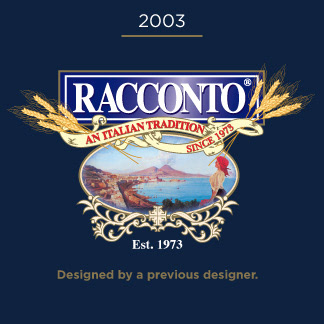
Racconto's previous logo prominantly featured wheat (for the pasta!) and the Bay of Naples where the Italian office is located. Our concern after a while became that the Bay of Naples fought for attention with the brand name.
Pantone Colors: 2748 & 871
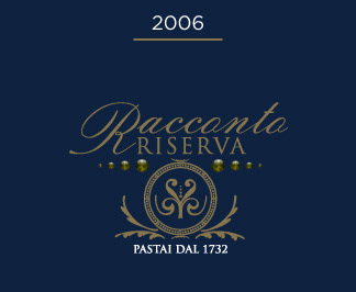
Racconto wanted to introduce a high end line of bronze die pasta and opted for a refined classical appearance.
Pantone 871
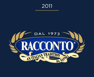
Racconto's current logo features simplified details with a high vibrance blue and stylized wheat so the brand name is front and center. I carried over the original logo typeface (Times New Roman Condensed) rather than sticking with a custom sans-serif typeface I designed. The customer base is acustomed to the current typeface and we felt it still worked well with the new styling. The banner which was at the top of the previous logo was kept as well for a touch of old world classicism.
Pantone Colors: 286 & 871
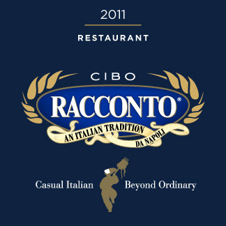
In late 2011, Racconto opened a restaurant in Rosemont, IL - aptly named Cibo Racconto. I incorporated a classic Italian character called Pulcinella into the tag line. Of course he had to be holding a fork with some pasta on it! :)
Pantone Colors: 286 & 871
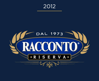
When it came time to update the Riserva line of products, we decided to homogenize the logo with the standard logo and swich out the banner for a new graphic element stating "riserva".
Pantone Colors: 286 & 871